
Case notes
Every touchpoint is the experience: designing for House of Hridaya
For a supper club, the brand isn't on a screen. It's in the envelope, the wax seal and the place card waiting at your seat.
- Filed under
- Case notes
- Written by
- The Aikyam studio
- Published
- Reading time
- 2 minutes
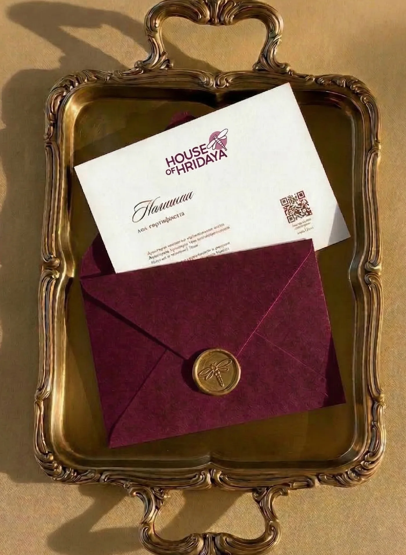
House of Hridaya hosts supper clubs, gatherings and cultural experiences: evenings of food, art and conversation, where strangers become guests and guests become community. The brand had to feel like being welcomed in.
The invitation is the first course
For most brands, the first impression is a website. For House of Hridaya, it's an envelope in your hand. So we started there. Pansy purple paper, a gold wax seal with a dragonfly pressed into it, and a card that slides out to say a seat is saved for you.
Moments meant to be felt, remembered and shared.
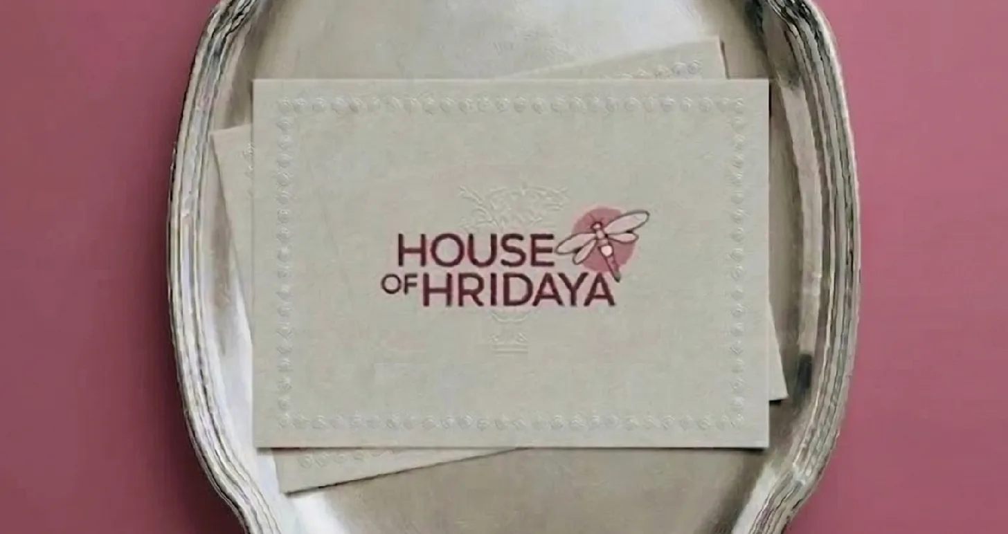
Why a dragonfly
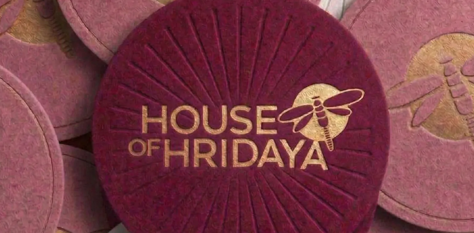
Gatherings are fleeting. A good evening hovers for a few hours and then it's a memory. The dragonfly carries that lightness: delicate, a little magical, never in one place for long. It sits beside the wordmark, on the seal, on the coasters, quietly tying everything together.
A table set in soft pinks
The palette is a table set in soft pinks and deeper tones: pansy, dawn, a dusty rose, lily and earthy browns. Warm enough for candlelight, rich enough to feel like an occasion.
Design for the hands, not the eyes
Embossing, foil, wax, heavy card. When people hold something well made, they slow down. That's the whole point of a supper club, so we leaned into anything with texture: place cards in the brand colours, a monogram pressed into the paper, stationery that feels like an heirloom.
If you're building an experience brand, list every object a guest touches, from the invite to the bill. That list is your real brand guideline.