Client project · 2026
Curated experiences. Shared tables. Living moments.

The brief
They don't just host events. They create moments.
House of Hridaya is a curatorial space where people come together through food, art and conversation: intimate gatherings, supper clubs and cultural experiences where every detail is chosen with care.
At its heart, it's about connection. The brand had to feel the way an evening there does: personal, warm and alive. Handmade, never corporate. The kind of thing you keep long after the night is over.
The invitation
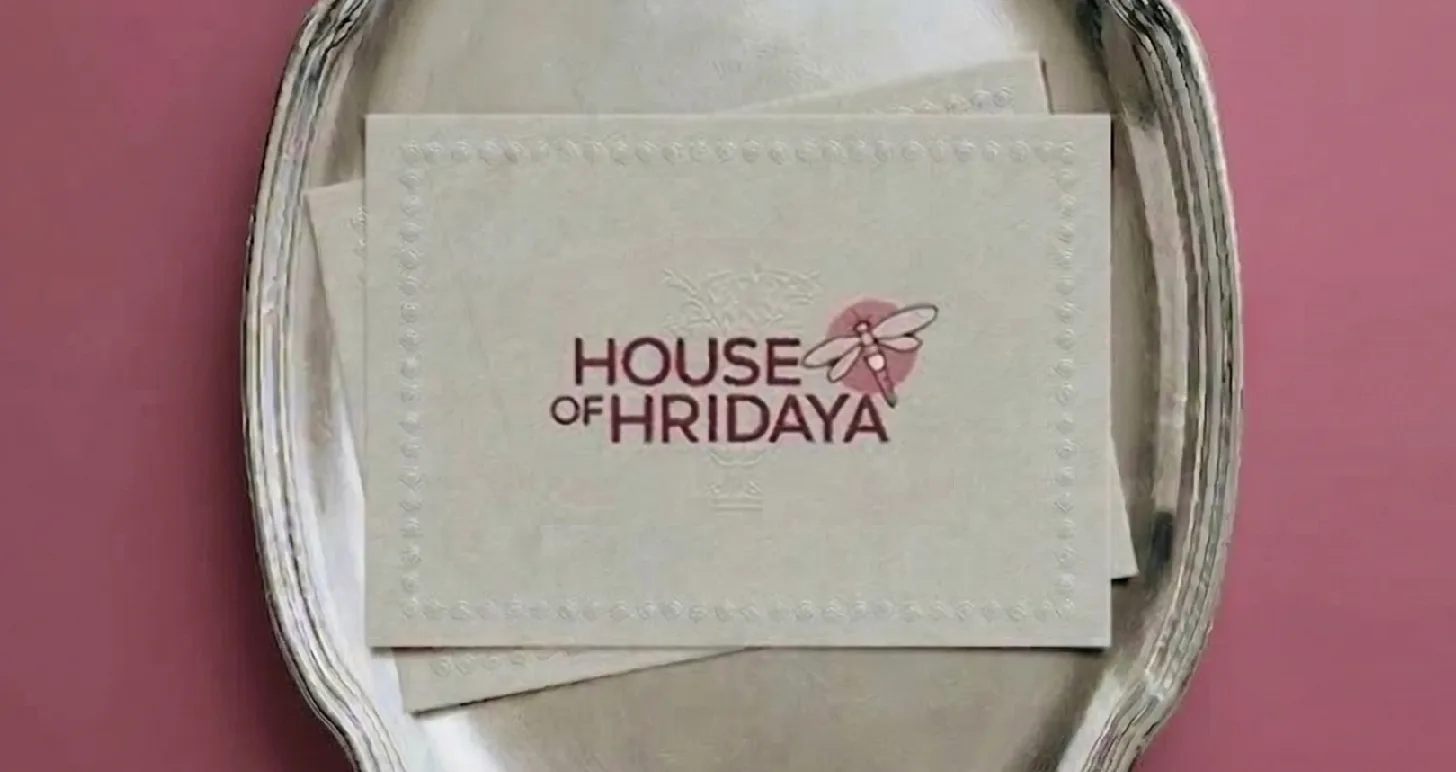
It starts before you arrive.
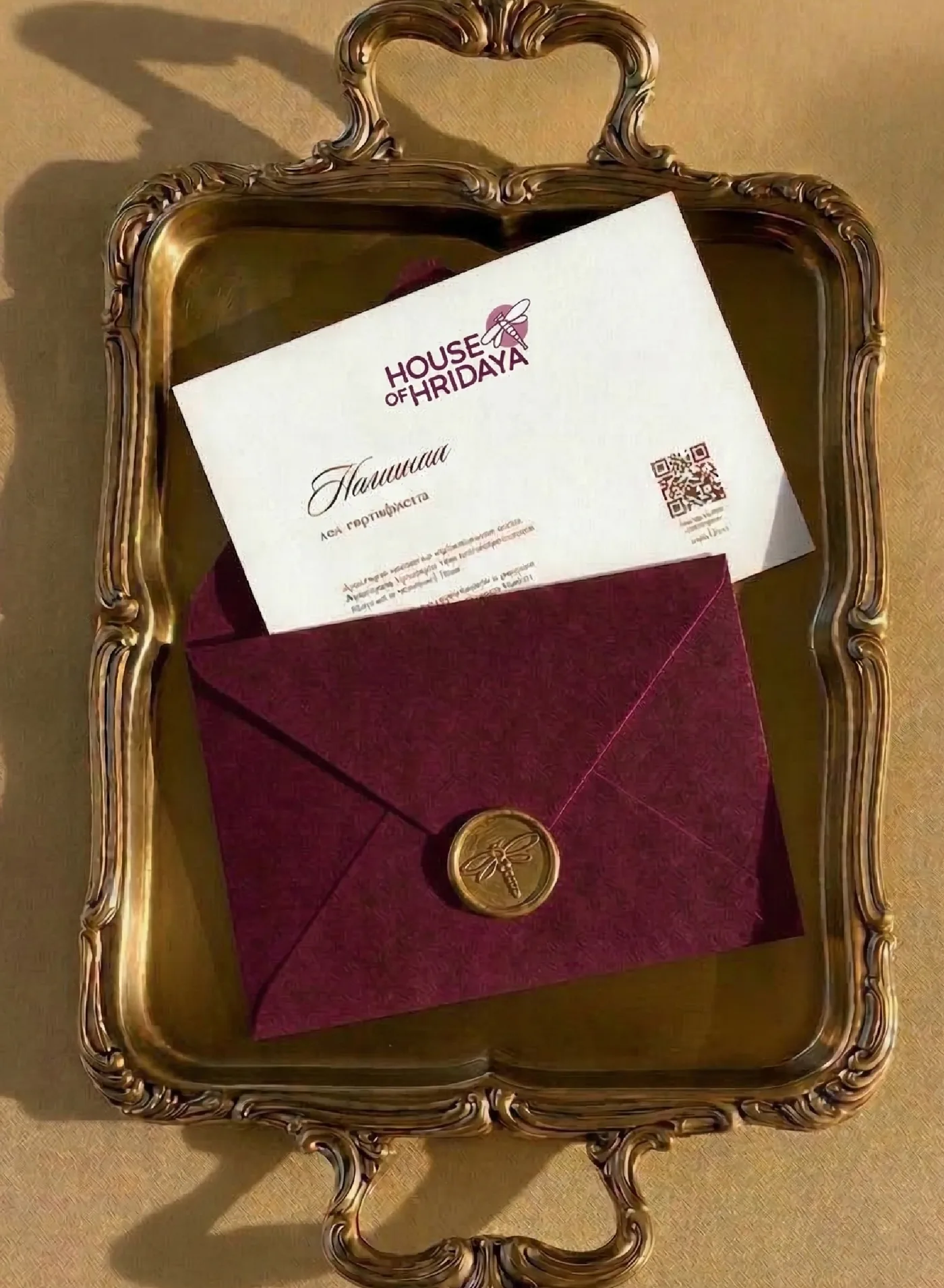
House of Hridaya comes to life through the details. From printed invitations to table settings, packaging and event spaces, every touchpoint is part of the experience: warm, tactile, and thoughtfully curated. Nothing overly polished. Everything human, personal and lived in.
Go on, break the seal.
The logo
Gathering, care and thoughtful curation.
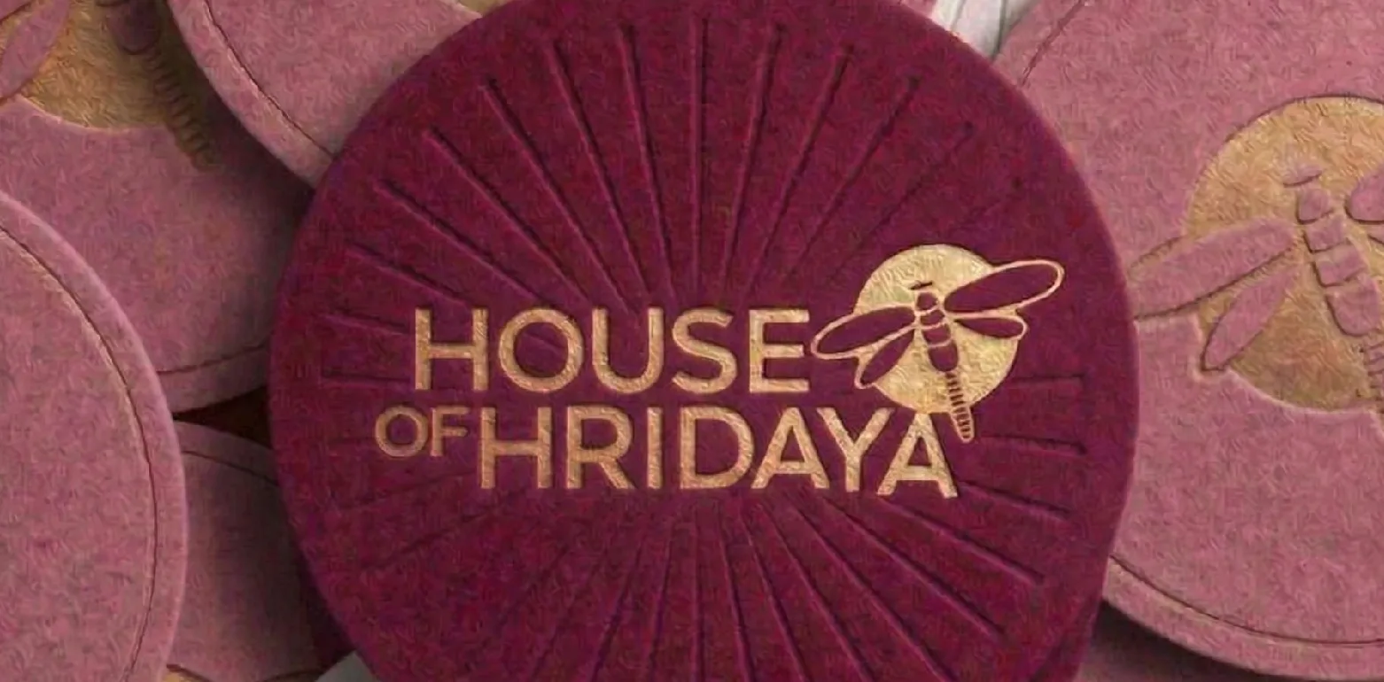
Hand-cut letters with a little texture, and a dragonfly settling in beside the name. Each version is built to hold its warmth on any background: dark on light, light on deeper tones, the dragonfly alone where the full name isn't needed.
Colour
A table set in soft pinks and deeper tones.
Warm, expressive and inviting. Soft pinks, earthy neutrals and deeper tones, drawn from food, flowers, textiles and the natural materials found in curated spaces. Every colour has a seat.
Primary
- Muted Pink#D27B97
- Dawn Pink#F2E7E3
- Lily#D3A1C9
- Pansy Purple#7D1C4A
- Clam Shell#CEBAAF
- Trendy Pink#9E5CA0
Secondary
- Highland#6C935C
- Lion#C79A78
- Woody Brown#4A2D2F
Typeface
Imperfect on purpose.
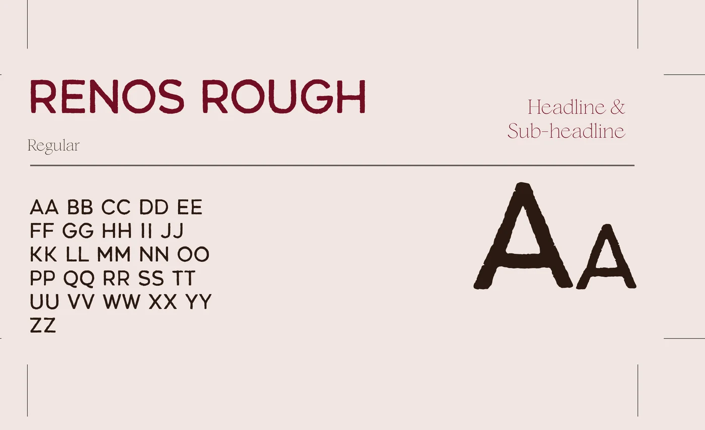
Renos Rough carries the headlines. Its textured, slightly imperfect form gives the identity a human, expressive quality, bold yet intimate. Simple supporting styles handle the longer reading, so the headline type stays the star of the table.
Out in the world
Seals, coasters and place cards.
Moments meant to be felt, remembered and shared.
Brand identity, logo system, colour, type, stationery and event collateral by Aikyam for House of Hridaya.