
Case notes
The stars came from the bricks: building a brand inside an old kiln
Mould is an art café in Ahmedabad, built inside an old brick kiln. We let the building do the talking.
- Filed under
- Case notes
- Written by
- The Aikyam studio
- Published
- Reading time
- 2 minutes
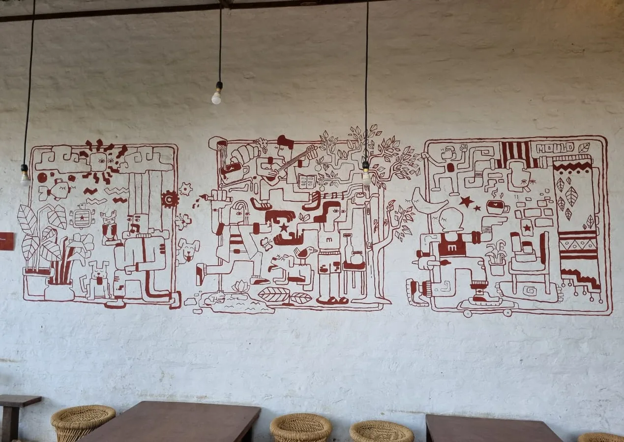
Some brands are logos and colours. Mould is more like a feeling: a rhythm, a slow exhale. It's an art café in Ahmedabad, built inside an old brick kiln, where people come for the coffee and stay for the experience. Our job was to make a brand that felt like walking in.
Earth from the kiln, colour from the garden
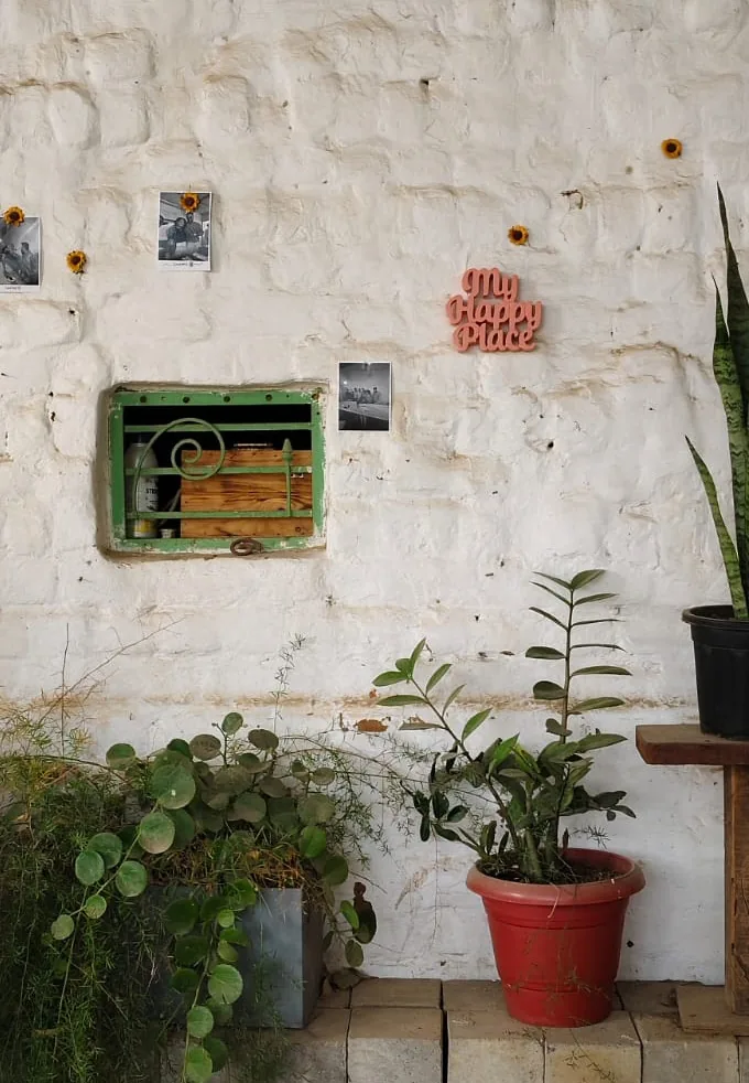
We didn't have to invent a palette. It was already there. Brick and cosmic white do most of the talking, straight from the walls. The secondary palette brings in the plants, the sunlight and the coffee.
A wordmark with a little whimsy
The logo had to feel confident and approachable at the same time. We let it keep small imperfections on purpose. They add human warmth, the same way a handmade cup feels better than a perfect one.
Characters with rules
The illustration system is where Mould really came alive. Bold outlines, whimsical details and a touch of organic charm. To keep it consistent across many hands, we wrote rules: filled hair, only eyes on the face, squarish hands, boxy clothes, rounded corners only.
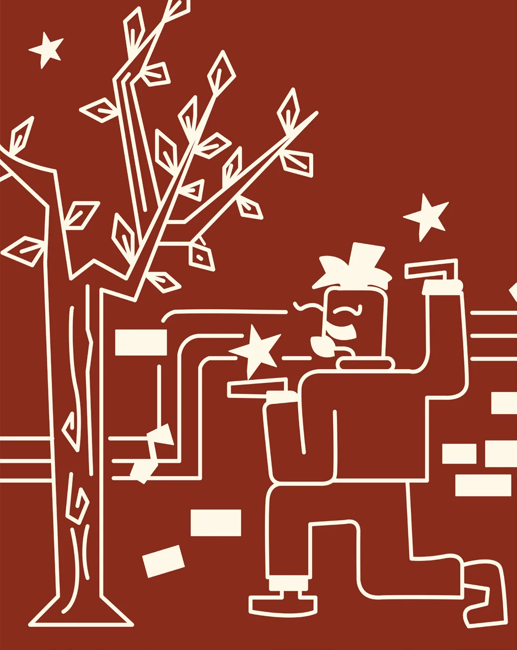
And the stars? They come from the bricks. Little rectangular pieces of the kiln float up and turn into stars in the illustrations. It's a small detail, and it carries the whole idea of the place: something old and heavy becoming something light.
And then the drawings left the page, and went on the walls.
Off the screen, onto everything
A café brand lives on cups, bags, placards, badges and the walls themselves, not in a PDF. So we designed for touch: packaging, signage, visiting cards and a social feed that feels like the space. The mural, in brick red on whitewash, made the building part of the brand.

Built to change
You won't find the same Mould twice. The furniture shifts, new corners emerge, old ones are reimagined. So the system had to be loose enough to grow with it. Nothing here is fixed, because neither is the place.